Thursday, March 27, 2014
Friday, March 14, 2014

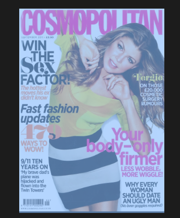
language - in this paricular magazine the magazine comes across as quiet formal and gosspiy as if the magazine was next to you whispering your ear like a friend would
aspirational - the coverline ' win the sex factor ' is aspireational as everyone wants to be the best in bed also the coverline 'your body only firmer ' is aspirational as everyone wants a sexy body
you can see the magazine is trying to be your friend and wants you to listen to what there saying these 3 things involoved in the magazine help get the reader attracted to the magazine , the coverlines also help as it reveals information from the inside which could help the customer be attracted as they might want to know how to get a good body
Thursday, March 13, 2014

modern- i chose this font as it is simplistic and smart and would appeal to a younger audience who are very modern in today society
kids - i picked this font because the letters are not the sasme thorughtout the word which wil appeal to a young audience as its all jumbled up and its something to think about for young kids
sport - i chose this for sport becuase its bold and ordered so the audience are aware of what the story is or the score or the important bits they need to know
masculoine- i chose this font for masculine as its very very large and powerful to read also the font is used in army context to resemble hardcore work
femine- i chose this font as the letters represent women and would suit a womens magazine or newspaper in a womens section as it is sophisticated and posh
sophisticated- i chose this font as it has a unique look to it to represent a clear and to the point lettering
bold- i chose this as it stands outfromother fonts and would attract the readers eyes straight away
history - i chose this as it would be associated with old news or newspapers such as - the times

Thursday, February 6, 2014
 COLOUR CONNOTATION MAGAZINES
different colours can convey different meanings or connotations to the viewer
sports: would be coveyed in the colours of red,orange and green as its physical and passionate as sports is very ethustiastic maybe about a team or sport . it would also be green as it portrayes love and acceptance for example people love football and accept other teams . orange protaryes sport as it is creative and ethuistatic towards the viewers
Monday, January 27, 2014

Monday, January 20, 2014

title ideas for magazine (teenage magazines )
- teen voice
- teenage dream
- gossip girls
- popteen
- girlfriend
- glam-teen
- high-school chick
- young and preppy
- teenThing
- whats hot and whats not
- teenage pout
ive chosen girlfriend as its a word used more commoly between girl friendships and would appeal to the teenage audience towards girls
cover lines for magazine
- how you can create a face men cant resist
- make fashion your passion
- spice up your school uniform
- get your summer body for 2014
- 50 flirting tips you have to try
- amp up your style
- how to get your body in shape
- easy hairstyles that will suit you
- make your skin clean now!
- 200+ bikinis find one that will suit your body
- how to get that millionaire hair
- get a glam tan
- classy isnt nasty
Monday, January 13, 2014


this magazine shows aysymmetry as the right side is compact with quiet big pictures but the left side is filled with smaller bits of writing but has a main image behind it . all this is aysmmetrical because there are several little tings on the left and big things on the right

this is aysmeetrical (colour) as it is vey bold colour through out the magazine front cover but has an image in the corner . the colour is bold which appeals to customers as its very colourful . its aysymmetrical as the colour is more bold than the picture in the corner
Friday, January 10, 2014

modern: i've chosen the font for modern as its very simple and easy to read which in modern newspapers and magazines is a must
kids: i've chosen this font for kids as it fun , good to loom at and very interesting which appeals to kids
sport : i've chosen this font for sport as its bold and needs to been seen for veiwers of the sport reading a paper or magazine
masculine: i've chosen this font for masculine as its very bold and strong , this font is usally used for the army which demonstares strong language
feminine : i've chosen this font for feminine as it has portrayed women in words which makes this feminine
sophisticated : i've chosen this font for sophisticated as very posh and formal and should be very neat for the upper class to read
bold: ive chosen this font because its bold and stays out from a normal font as its oulines with black and usally used in headlines to be seen
history: ive chosen this font asit is associated with history as its big bold and very ellegent
Subscribe to:
Posts (Atom)