sonny prior GCSE blogger page
Thursday, March 27, 2014
Friday, March 14, 2014
i chose this magazine as it is for boys 7-14 , it is assciated with football , it covers all the tops stories happening within that week of football , the masthead stands out as a warning as its in yellow and black , the black font is bold and big but nothing fancy as its for kids and the yellow background brings out the black writing and makes it more appealing , the magazine has chosen a very aspirational player as he is a legend in the premier league being top scorer 2 and 1 premier leauge title so for kids he is a very inspiring player to all kids that like or play football . the coverlines are appealing as it has over aspiraional players on and a free poster which will help sell the magazine
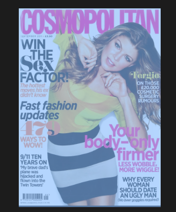
address - the model from the magazine 'fergie' from the black eyed peas is looking straight into the camera which means there looking at you and there is a direct coverline saying your 'your body' therefore talking to you
language - in this paricular magazine the magazine comes across as quiet formal and gosspiy as if the magazine was next to you whispering your ear like a friend would
aspirational - the coverline ' win the sex factor ' is aspireational as everyone wants to be the best in bed also the coverline 'your body only firmer ' is aspirational as everyone wants a sexy body
you can see the magazine is trying to be your friend and wants you to listen to what there saying these 3 things involoved in the magazine help get the reader attracted to the magazine , the coverlines also help as it reveals information from the inside which could help the customer be attracted as they might want to know how to get a good body
Thursday, March 13, 2014
modern- i chose this font as it is simplistic and smart and would appeal to a younger audience who are very modern in today society
kids - i picked this font because the letters are not the sasme thorughtout the word which wil appeal to a young audience as its all jumbled up and its something to think about for young kids
sport - i chose this for sport becuase its bold and ordered so the audience are aware of what the story is or the score or the important bits they need to know
masculoine- i chose this font for masculine as its very very large and powerful to read also the font is used in army context to resemble hardcore work
femine- i chose this font as the letters represent women and would suit a womens magazine or newspaper in a womens section as it is sophisticated and posh
sophisticated- i chose this font as it has a unique look to it to represent a clear and to the point lettering
bold- i chose this as it stands outfromother fonts and would attract the readers eyes straight away
history - i chose this as it would be associated with old news or newspapers such as - the times
Thursday, February 6, 2014
 COLOUR CONNOTATION MAGAZINES
different colours can convey different meanings or connotations to the viewer
sports: would be coveyed in the colours of red,orange and green as its physical and passionate as sports is very ethustiastic maybe about a team or sport . it would also be green as it portrayes love and acceptance for example people love football and accept other teams . orange protaryes sport as it is creative and ethuistatic towards the viewers
Subscribe to:
Comments (Atom)


